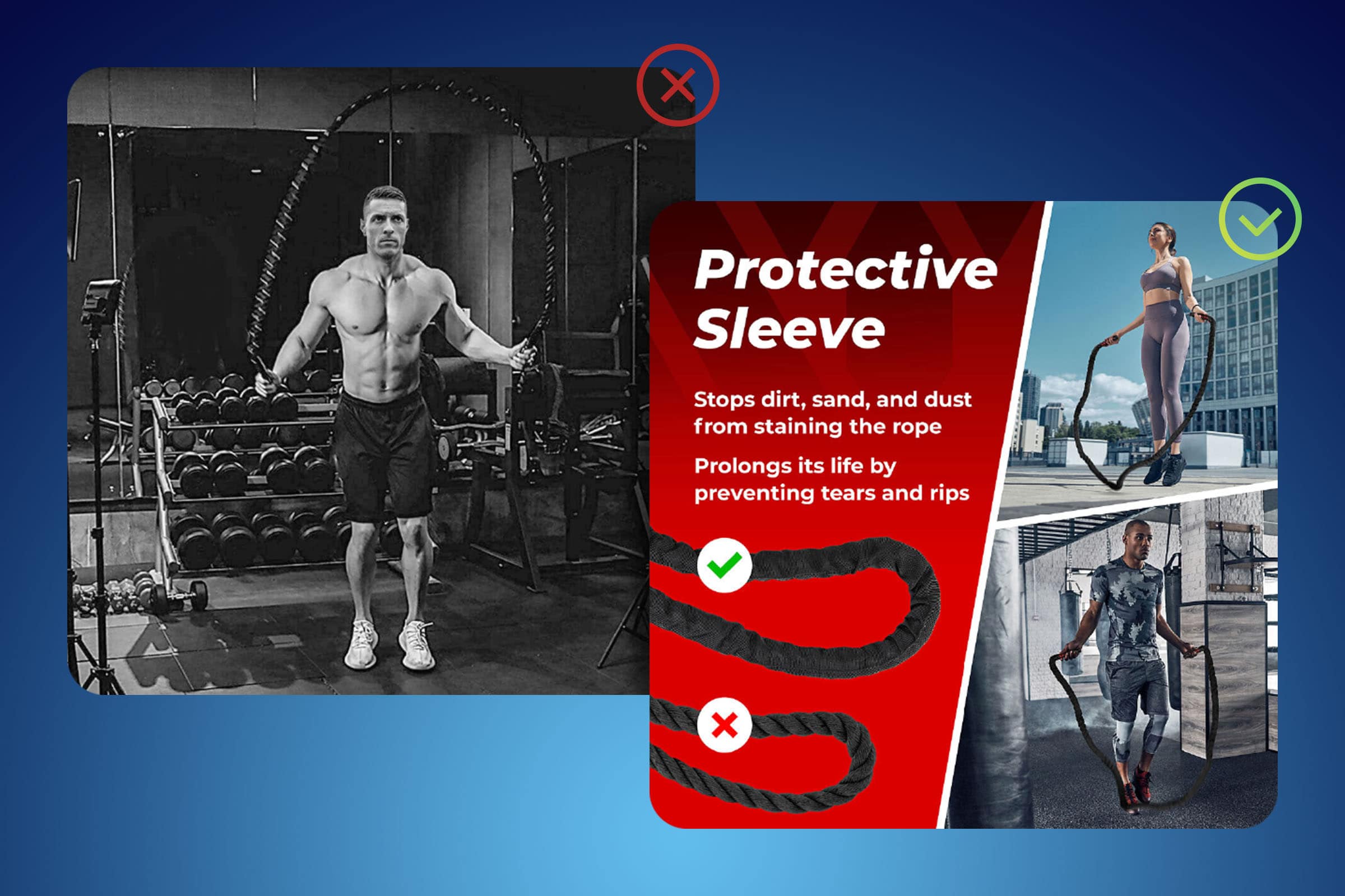
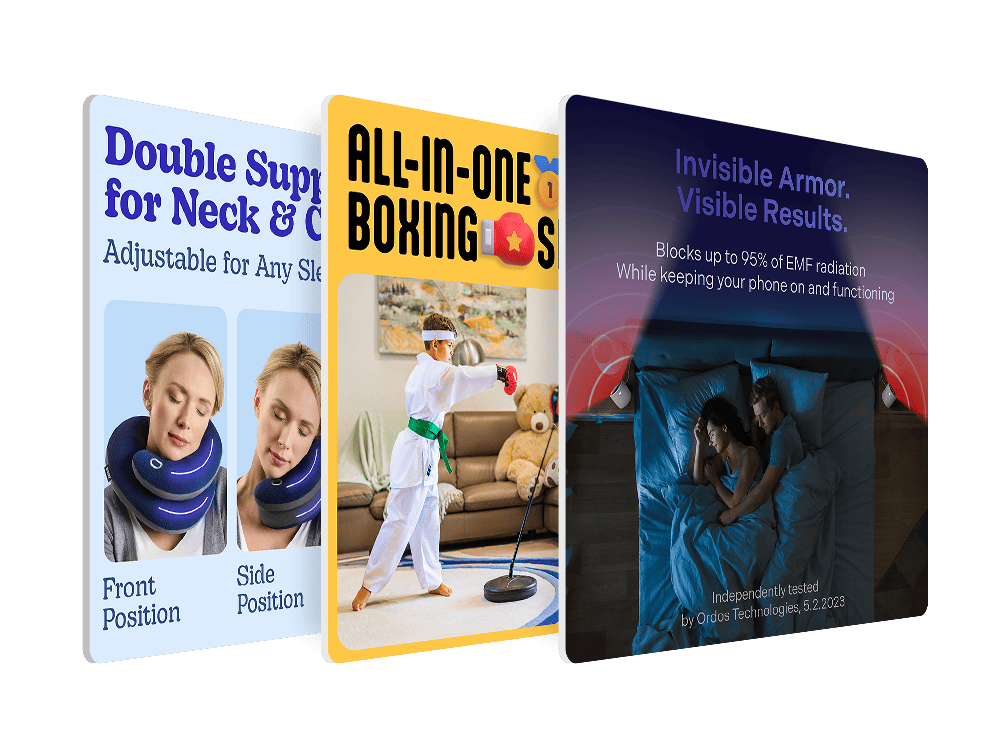
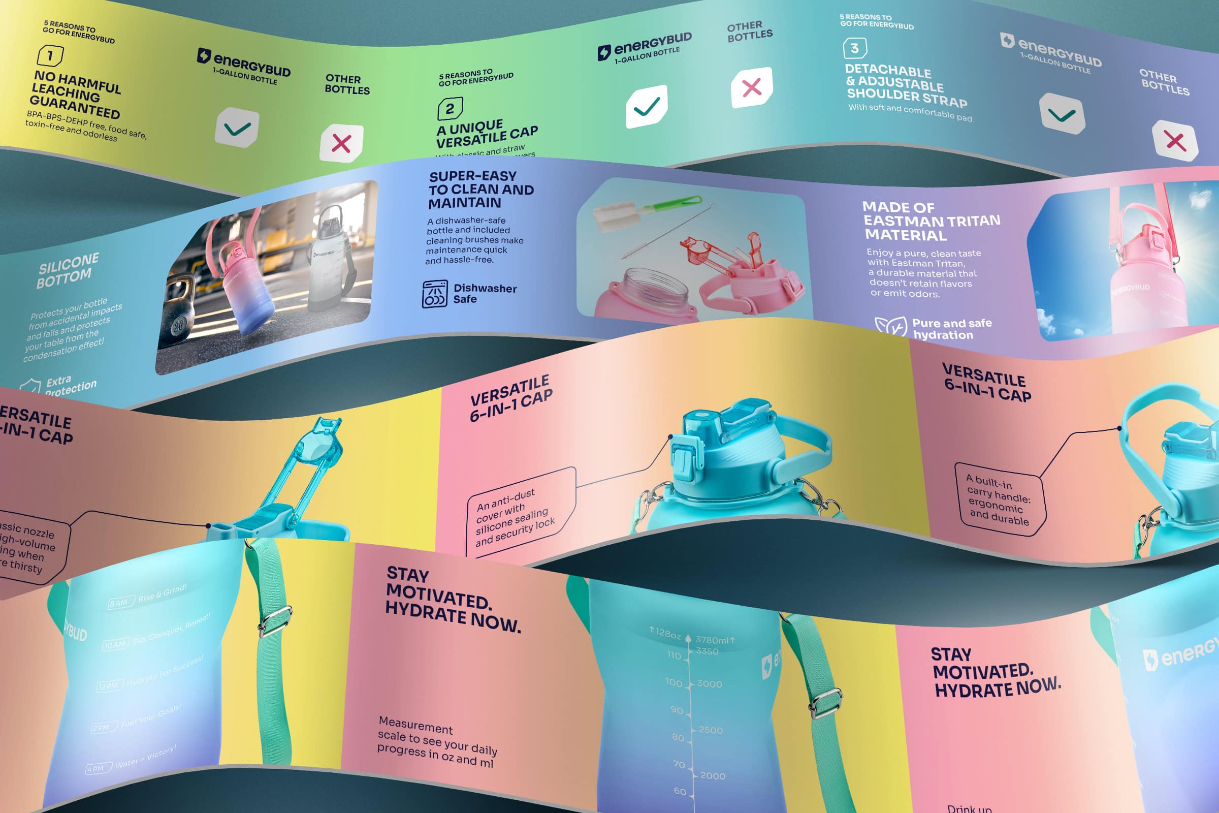
A design studio’s guide to mastering the magic of Amazon Premium A+ Content that turns browsers into buyers
Explore Premium A+ Content that can boost your sales by up to 20%
A+ Content is the section that Amazon customers reach when they scroll down past the Gallery images and the text descriptions in your listing. You as a seller can have either Standard or Premium A+ Content (see eligibility requirements), and you want to have Premium by all means.
We’ll discuss all the modules Premium A+ Content content and share some insight on how to use them wisely so that you sell more on Amazon. Insight comes from experience: in 15 years in content creation for online marketplaces, we’ve done more than 1,000 Amazon projects, many of them with Premium A+ Content.
First things first: Why Premium A+ Content is better than Standard
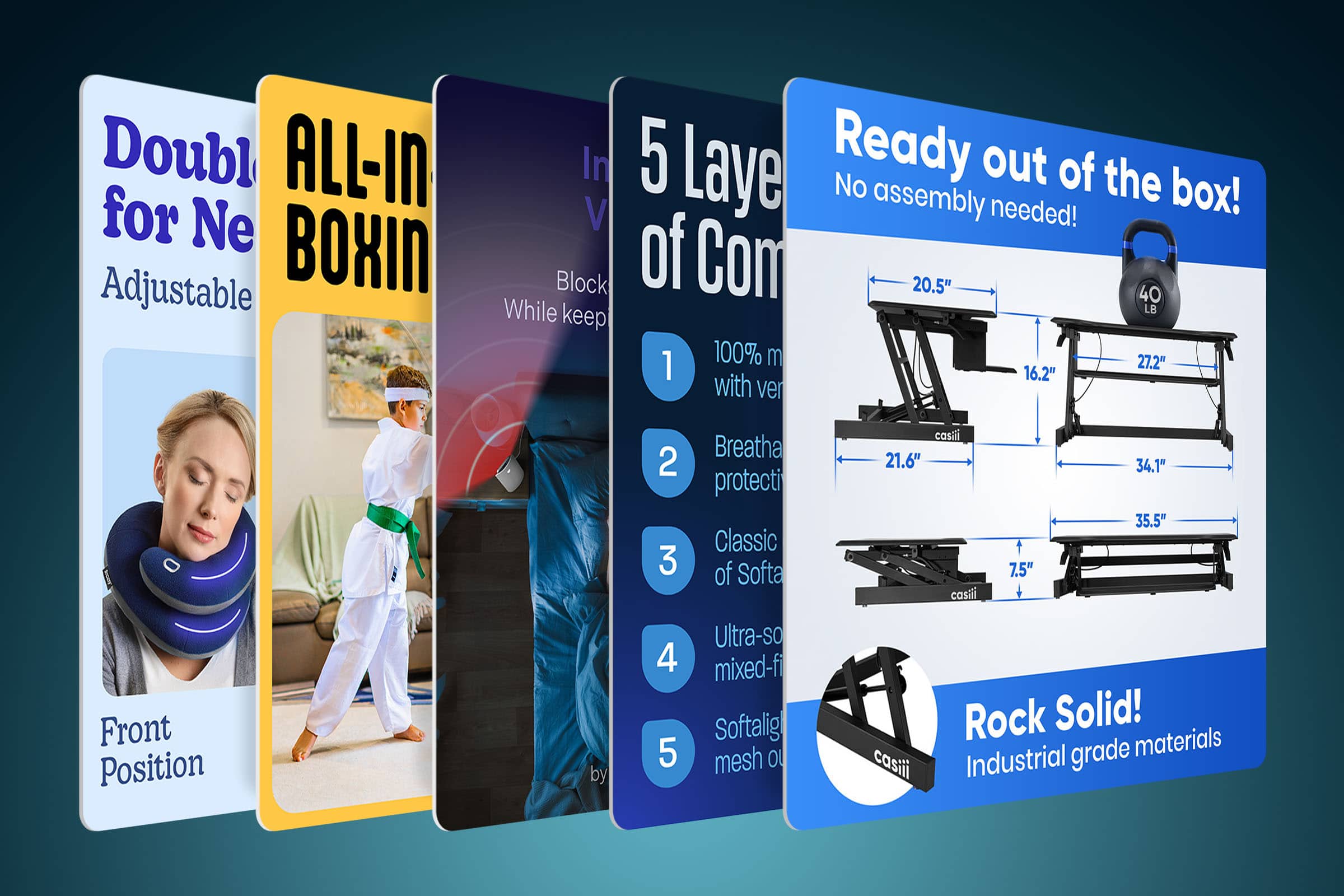
In Premium A+ Content, the images are larger and wider than in Standard. They’re much more visually appealing, and according to Amazon’s calculations, implementing Premium A+ content may increase your sales by up to 20%.
Also, in Premium, the images follow one another with no gaps, so you can build a fluent visual column where all the graphical elements flow from top to bottom as if it’s a custom-designed landing page. We know how to make it look stunning.
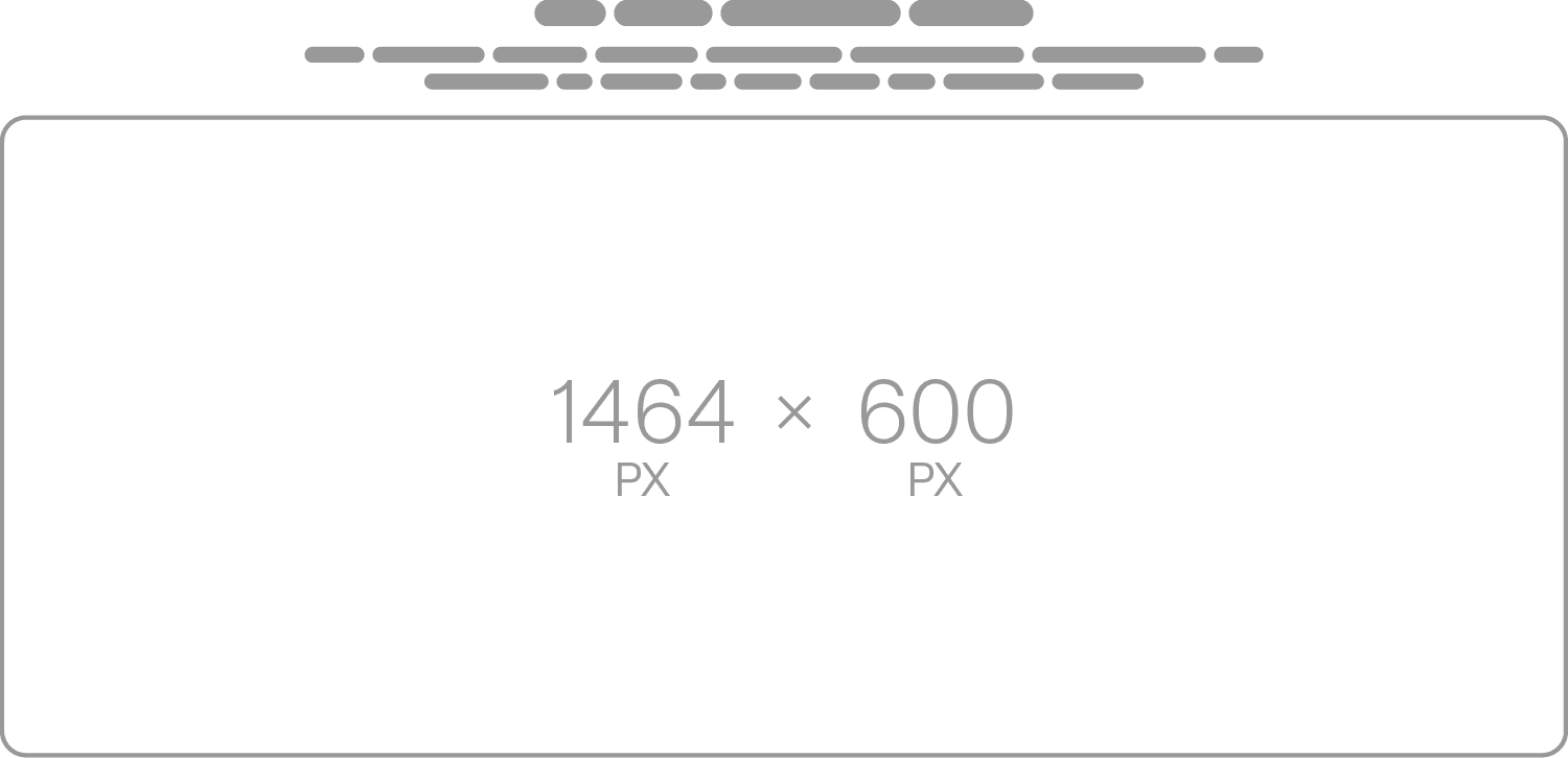
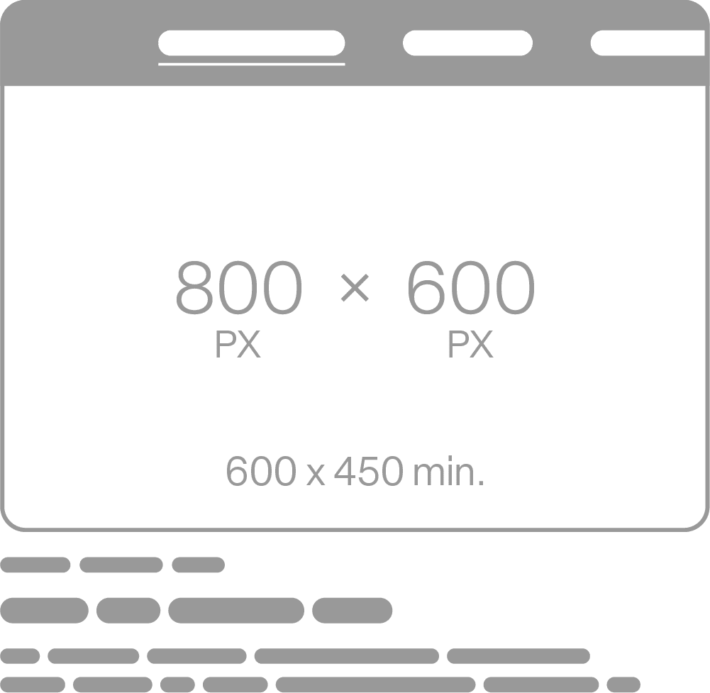
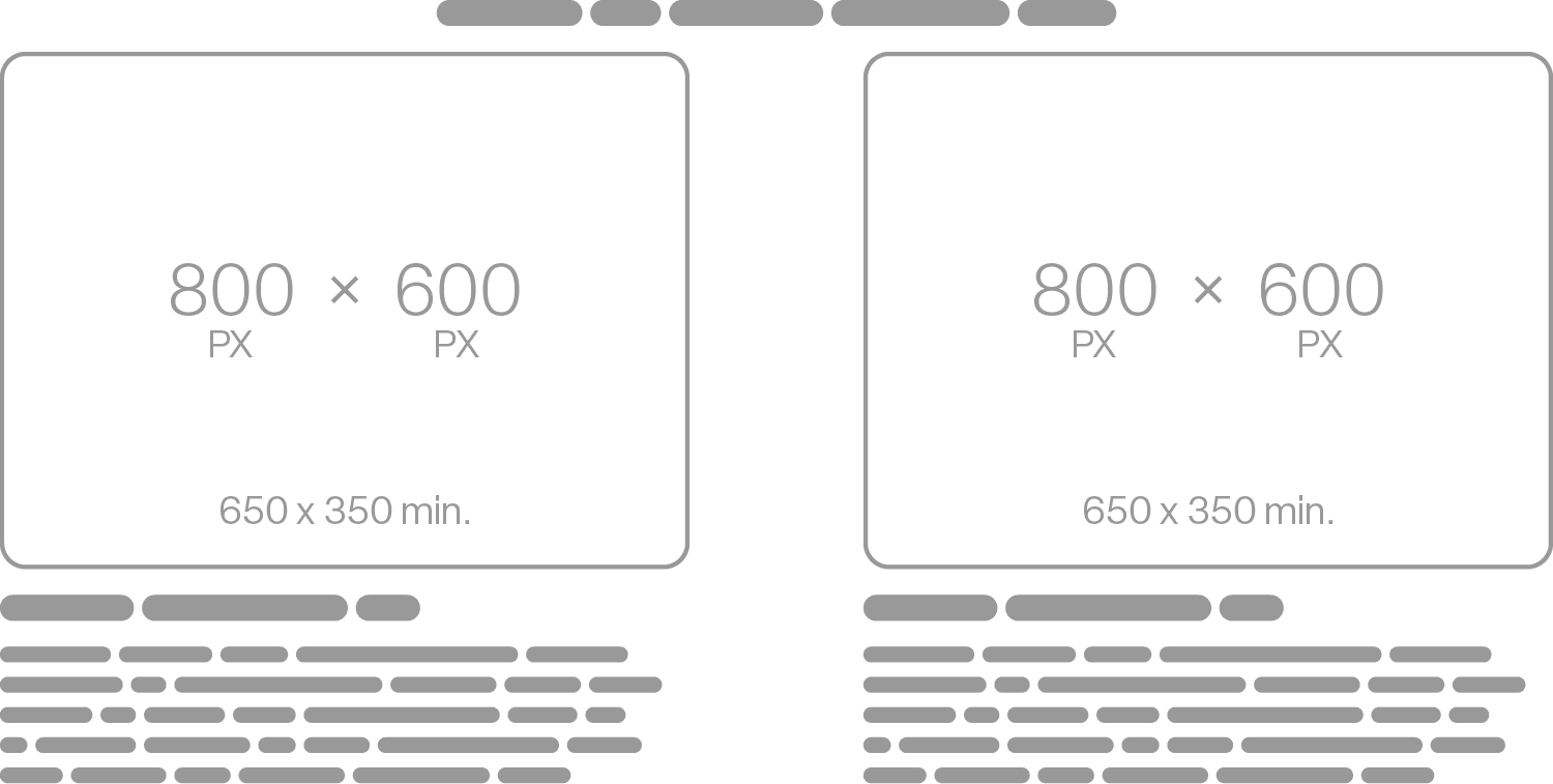
Another benefit is that Premium A+ Content has a mobile version. As all sellers know by now, most Amazon browsing is done on mobile devices, and it’s precious to have an opportunity to make images for the mobile version separately. The mobile modules are smaller (800×600 pixels as opposed to 1,464×600), but we can arrange elements on them a bit differently for optimal performance on smartphone screens.
One more thing before we dive in:
What you can’t use in A+ Content (either Standard or Premium)
When you submit your A+ Content to Amazon, a human moderator will review it before it is shown to customers. Amazon enforces strict rules on what is permissible there, so to ensure compliance, let’s review some key prohibitions. (Go to the A+ Content Guidelines for comprehensive details; the following are key points with expert comments from us.)
Images you’ve already used in the Gallery
A+ Content is your additional chance to captivate shoppers, so you want to create new visuals for it. If your budget is tight, do the 3R thing: reusing, recropping, and repurposing. You can work with the images you already have and add just a little bit of new images. We’ve done this for our clients, and we confirm that it’s a viable strategy.
Registered and trademark signs
These two symbols, ® and ™, are directly prohibited in A+ Content. If one of the USPs of your product is that it’s made of a trademarked material or, say, features a technology that’s registered, you want to emphasize it on the Gallery images and in text in your Feature Bullets, but for A+, the characters will have to be removed. Clearly, the material or the technology still make up a strength of your product, and we’ll try to stress them in A+ as much as elsewhere.
Anything about discounts, bonuses, and warranties
You can’t say anything about promotions, bonus items, or special offers in A+ Content. Amazon will only let you have your A+ Content as a truthful description of what your product is like: no marketing tricks are allowed. Also avoid words like “free” and “affordable,” and no calls to action like “add to cart,” “buy now,” “shop with us,” or “get yours now.”
There are ways to get around this ban. If you’re selling a kit with something extra included (effectively a bonus that your competitors don’t offer), you can mention it as an “extra item” because it makes up a Unique Selling Proposition (USP), and you don’t want the shoppers to miss it.
Claims related to sustainability
If your product is “recyclable” or “ecological” and you want to state it in A+ Content, be prepared to show certificates or other documents that prove your statement. Otherwise, don’t use these words: Amazon is highly allergic to them. The words “eco-friendly,” “biodegradable,” and “compostable” are simply prohibited, and you can’t use them either on images or in text.
Logos that aren’t yours
If you have certification from a reputable organization that you want to boast about, we’ll surely add the organization’s logo to one of the images in the Gallery images, but in A+ Content, it’s banned. Your competitors’ logos are banned, too.
Amazon says it can make exceptions in cases where the use of someone else’s logo is “logical or beneficial.” So if you must, you can give it a shot. If it’s not critical, you better stay on a safe side and omit logos that aren’t your own.
Anything about Amazon itself
You can’t show Amazon reviews from shoppers (or, in fact, any reviews) in A+ Content. Even if you have a lot of positive feedback from your customers, A+, sadly, is not where you can brag about it. Nor can you use any of Amazon’s graphical elements, like their logo, buttons, and UI elements.
A lot of small text
Amazon sets the minimum text size for A+ Content at 16 pixels, and it might be tempting to include extensive text to detail all of your product’s benefits. But we know from experience that 16 pixels is way too small (practically illegible on mobile devices), so we advise using significantly larger text.
Non-descriptive alt-text for the images
For each image in A+ Content, you can include a brief description (no more than 100 characters) that was previously known as “image keywords” but is now called alt-text. This is for those who rely on screen readers to access your listing audibly instead of visually. Alt-text is factored into Amazon’s indexing (it affects search algorithms and plays a role in what appears when people search on Amazon). Historically, sellers would overload this text with keywords (the practice is called keyword stuffing and is intensely disliked by Amazon) rather than genuinely describing the images. You shouldn’t do it. When preparing alt-text, we ensure it provides an accurate depiction of the image and add no more than one relevant keyword per description.
Now, we’re done with what we can’t do. Time to check what’s unrestricted. Let’s consider each available module.
1. Premium Full Image
The best choice, for a good reason. It’s just as big and wide as it gets: perfect to capture your potential customers’ attention. We can build entire Premium A+ Content with just this module alone in some cases. It’ll be a beautiful gapless canvas showcasing all of your product’s strengths clearly and boldly.
Desktop version
Mobile version
Amazon Thumbnail
Content Guidelines
Headline: 80 characters
Body: 300 characters
2. Premium Background Image with Text
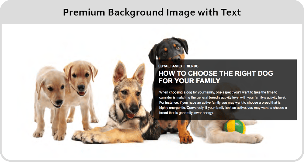
This module is worse than the previous one. Text here can be formatted, true, but it’s still most likely to look ugly. A general note on adding texts: we’ll always prefer to write something right on the image graphically instead of using Amazon’s textboxes. In the first case, we can use our client’s brand fonts and make it all look pretty. That’s better than textual blocks on images. Besides, in the mobile version of this module, the text will go beneath the image and break the gapless flow from one image to another. Esthetically, we don’t want that.
Desktop version
Mobile version
Amazon Thumbnail
Content Guidelines
Subheadline: 40 characters
Headline: 60 characters
Body: 300 characters
The text box can be positioned to the left or right.
Text color can be black or white.
3. Premium Full Video
Definitely use this module if you can. Videos are engaging and build trust in your potential customers.
A video you add to your Premium A+ Content can have a cover: an image the shopper sees before they click on the Play button. It doesn’t have to be a frame from the video—you’re free to use any kind of graphics and text in this cover image. We always make covers for the videos so that this module becomes a full-scale part of your A+ Content visually.
The thing to remember here is that this module is the only one that doesn’t have a mobile version. On mobile devices, the cover will be the same as on desktop. So we can’t use small texts here: they won’t be readable on phones.
Desktop version
Mobile version
Amazon Thumbnail
Content Guidelines
Video type: .mp4 only
Video resolution: 960:540 (min)
Video size: 200 MB (max)
Video length: 180 sec (max)
Image (for video preview): 1464px W x 600px H (min)
Headline: 80 characters
Body: 300 characters
4. Premium Hotspots 1
We rarely use these because content-wise there are better options. But if you want to show up to six product features in one image AND you want this module to be interactive (on desktop only, though), you can give it a try.
In the mobile version, hotspots will be gone; instead of them, you’ll have a simple image carousel (see below) and separate images for each hotspot.
Desktop version
Mobile version
Amazon Thumbnail
Content Guidelines
6 hotspots (max.)
Hotspot headline: 50 characters
Hotspot body text: 200 characters
5. Premium Hotspots 2
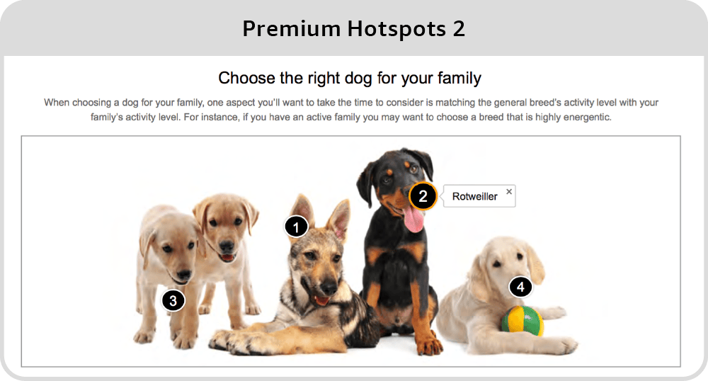
The difference between this module and Premium Hotspots 1 is that the second one has numbers for hotspots, ugly border around the image, and an optional paragraph of text with a heading above the image. The image also looks smaller on desktop, compared to the ‘Hotspots 1’. All the rest is exactly the same. Considering the differences, you should choose the Premium Hotspots 1 option over this one.
Desktop version
Mobile version
Amazon Thumbnail
Content Guidelines
6 hotspots (max.)
Module headline: 80 characters
Body text: 300 characters
Hotspot headline: 50 characters
6. Premium Simple Image Carousel
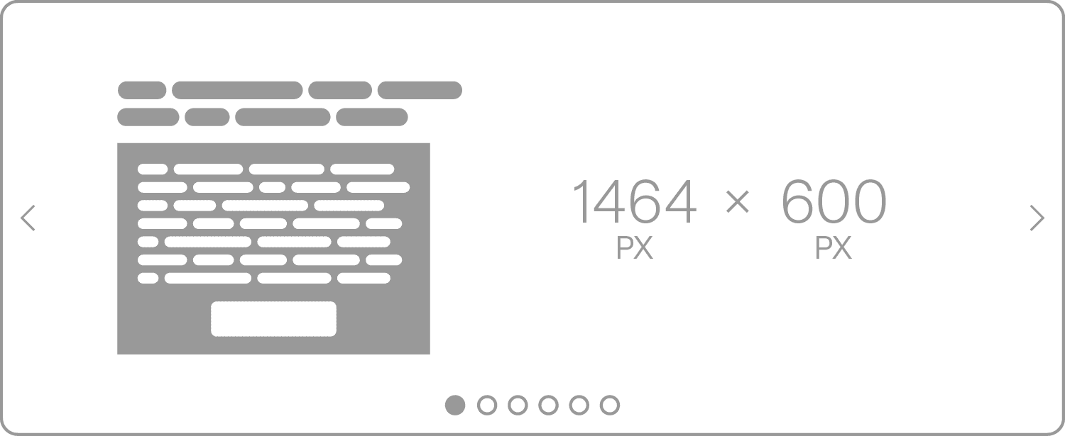
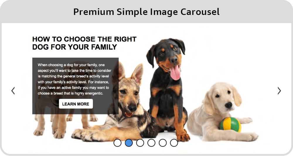
That’s a slider carousel. Sliders are great because they allow adding a maximum of six pictures in one module instead of just one. We use this module quite a lot. This carousel has textboxes, too, and they look horrible. We never use them.
To clearly show the shoppers that this is a slider that they can swipe to see more, we can write something like “Click here” right on the images.
There’s just one downside to this excellent module: in the mobile version, the navigation dots are placed under the picture instead of above, as they are in the desktop version. This disrupts the flow of the A+ content—unless you use a white background, which we sometimes resort to just because of this issue. Amazon designers, if you’re reading this, please fix this UI mistake.
Desktop version
Mobile version
Amazon Thumbnail
Content Guidelines
Slides: 2 min – 6 max
Headline text: 50 characters
Body text: 200 characters
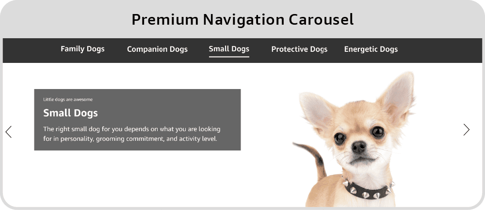
7. Premium Navigation Carousel
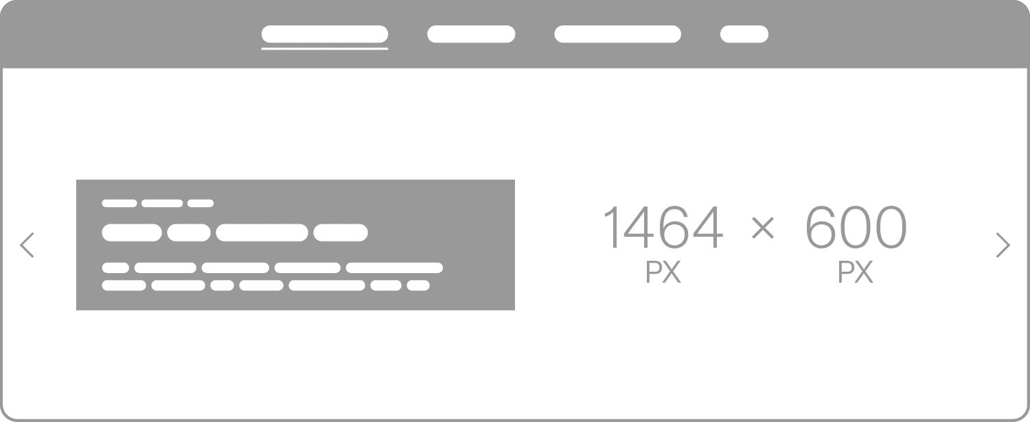
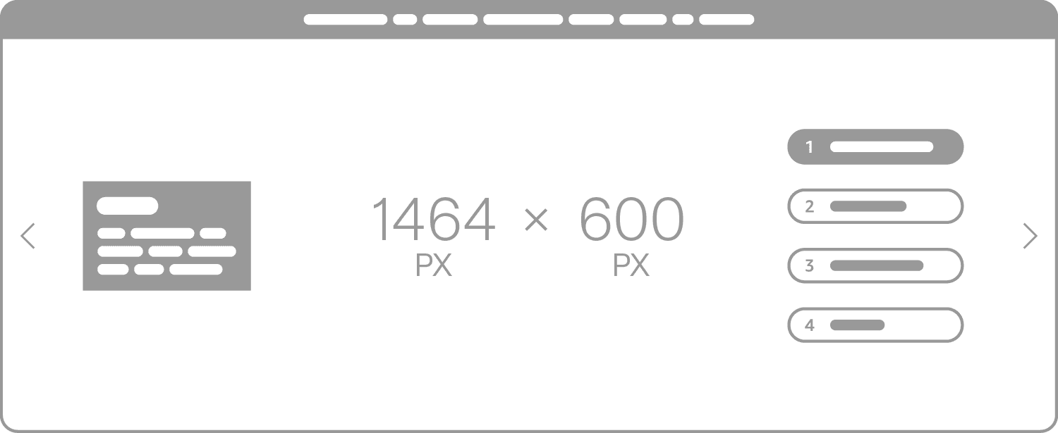
As designers, we primarily see the transparent black stripe at the top of this module. It can ruin the image. If we want to make it work, we need to use some black elements on the image, which is not always a good idea. Again, it depends on the concept we choose for the way your Premium A+ Content is going to look.
What’s good about this module is that it shows headings for all the images included in it (a maximum of five). It can be very relevant: for instance, we used this module in a listing about a pack of coffee capsules with different flavors, so the customer can see the names of all the flavors right away.
Desktop version
Mobile version
Amazon Thumbnail
Content Guidelines
Slides: 2 min – 5 max
Navigation text: 25 characters
Subheadline: 25 characters
Headline: 25 characters
Body text: 100 characters
8. Premium Regimen Carousel
Never use this module. On phones, it’s just repelling.
As we explained, texts upon images will never look good. It’s always better to add any text graphically than use Amazon’s textboxes.
Desktop version
Mobile version
Amazon Thumbnail
Content Guidelines
Slides: 2 min – 6 max
Module headline: 100 characters
Inset headline text: 20 characters
Inset Body text: 100 characters
Navigation text: 20 characters
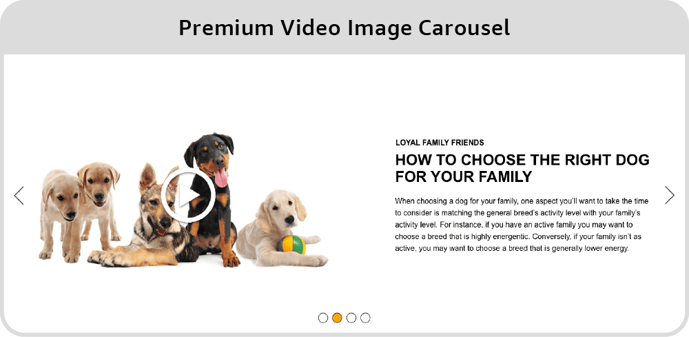
9. Premium Video Image Carousel
This module is similar to the ‘Premium Single Image with Text,’ but it functions as a carousel, allowing to add 2-6 images or videos. When it comes to images, we’d choose the ‘Simple Image Carousel’ 99 times out of 100. However, with videos, the decision isn’t as clear-cut.
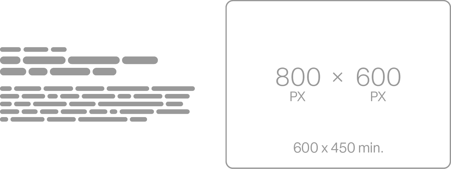
That’s the only opportunity to add several videos in one module, but it comes at a price: the text to the right. We’ll only use it if your product has several features that need to be explained at length with words. On mobile devices, the texts will go below the videos.
Desktop version
Mobile version
Amazon Thumbnail
Content Guidelines
Slides: 2 min – 6 max.
Video type: .mp4 only
Video resolution: 800:600 (min)
Video size: 200 MB (max)
Video length: 180 sec (max)
Image: 800px W x 600px H (min)
Module headline: 80 characters
Slide headline: 50 characters
Slide subheadline: 80 characters
Slide body text: 500 characters
Video title: 50 characters
Video description: 200 characters
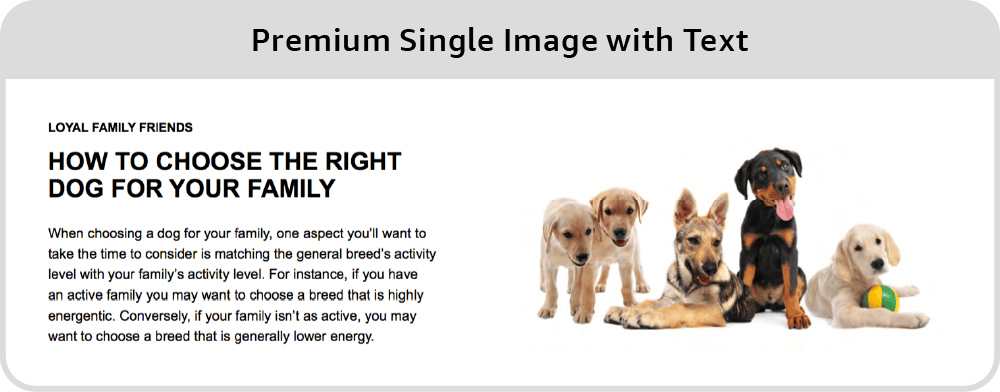
10. Premium Single Image with Text
These are good for products that require long textual descriptions. Normally, shoppers don’t read large blocks of text on Amazon, but your case may be an exception.
For instance, if you’re selling a face cream and you want to list all of its ingredients, use this module and accompany it with an image: it’s better than wasting a whole module on plain text.
Desktop version
Mobile version
Amazon Thumbnail
Content Guidelines
Subheadline: 40 characters
Headline: 80 characters
Body: 500 characters
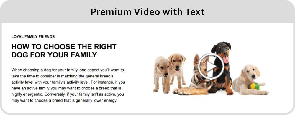
11. Premium Video with Text
Same as Premium Single Image with Text, but with a video instead of an image.
Desktop version
Mobile version
Amazon Thumbnail
Content Guidelines
Video: 800px W x 600px H (min)
Video size: 200 MB (max)
Video length: 180 sec (max)
Image (for video cover): 800px W x 600px H (min)
Subheadline: 40 characters
Headline: 80 characters
Body: 500 characters
Video title: 50 characters
Video description: 200 characters
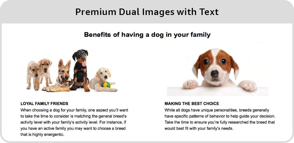
12. Premium Dual Images with Text
You can use this module, featuring to medium-sized images, headline, and text under each one of them, if your product has a lot of minor features that need to be mentioned separately. In most cases, we’ll go big and make large images instead of small ones, using one of the carousel modules: large ones are more eye-catching.
Desktop version
Mobile version
Amazon Thumbnail
Content Guidelines
Module Headline: 50 characters
Image Headline: 50 characters
Body: 300 characters
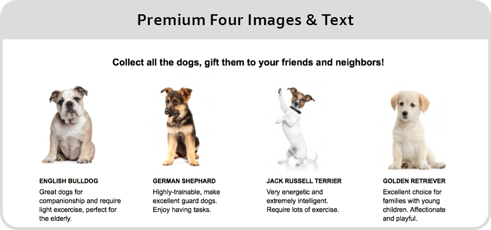
13. Premium Four Images & Text
Similar to the ‘Dual Images & Text’ module, this one features four small images, a headline, and text. As you’ve probably noticed, we’re not big fans of Amazon’s generic textboxes. Premium A+ Content offers better alternatives. However, for some projects, this module might still be relevant.
Desktop version
Mobile version
Amazon Thumbnail
Content Guidelines
Module Headline: 80 characters
Image Headline: 30 characters
Body: 150 characters
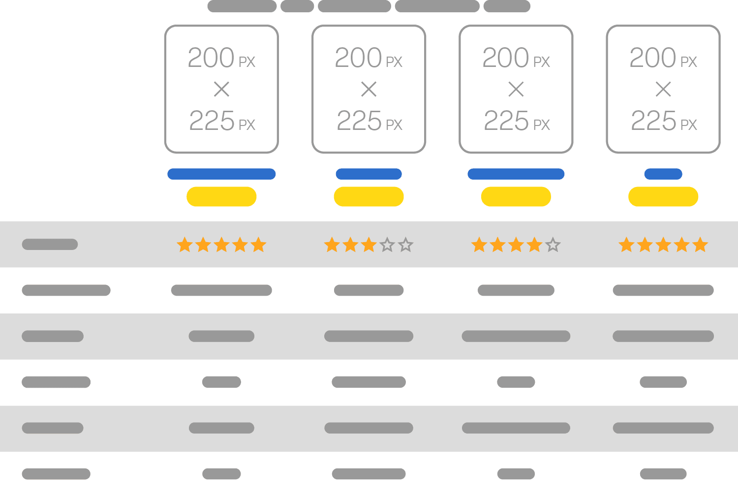
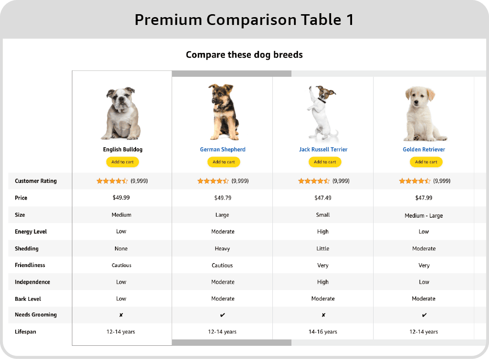
14. Premium Comparison Table 1
Comparison Table Type 1 is especially popular (it’s similar to the Comparison Chart module in Standard A+ Content). It gives you a rare chance to insert links to other products you have, including the ‘Add to Cart’ button right under each version. It’s a precious opportunity to engage potential customers. Yes, you can add links to your other products in the Brand Story module, but this option is also great, since people are usually interested in comparisons.
Amazon restricts this module to one instance only per each Premium A+ Content.
Desktop version
Mobile version
Amazon Thumbnail
Content Guidelines
Products to compare: 4 min – 7 max
Features: 5 min – 12 max
Module headline: 80 characters
Image headline: 25 characters
Feature: 30 characters
Tooltip: 150 characters
Detail: 30 characters
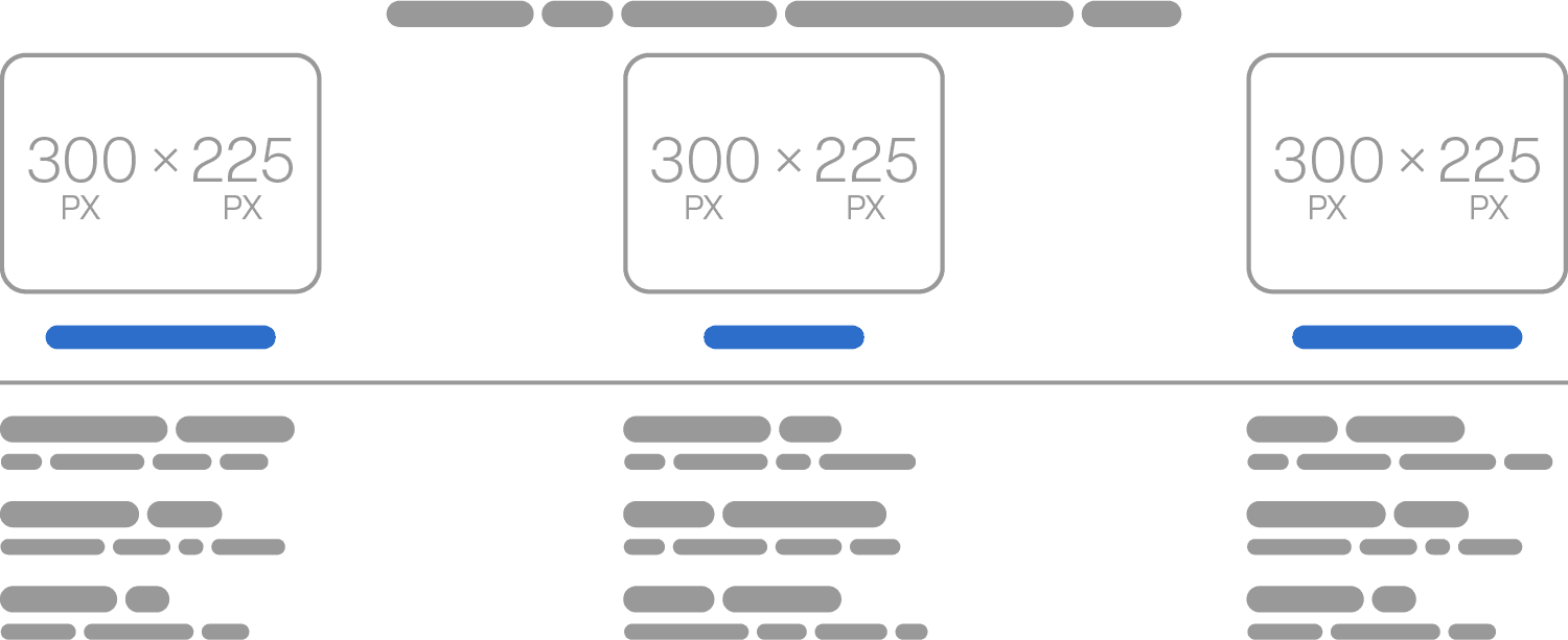
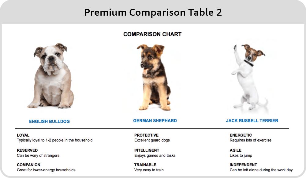
15. Premium Comparison Table 2
Type two offers a more flexible format for listing your products’ features without the rigid structure of a common comparison column on the left. This is ideal when your products are quite different from one another and need to be highlighted individually. However, it does have a drawback—you can’t include “Add to Cart” buttons, which limits immediate conversions compared to the first type. Additionally you can only fit 2 or 3 products in this module, compared to up to 7 products in Type 1. Still, this layout works well for detailed feature breakdowns where a direct comparison isn’t necessary.
Desktop version
Mobile version
Amazon Thumbnail
Content Guidelines
Products to compare: 2 min – 3 max
Features: 2 min – 5 max
Module headline: 80 characters
Image headline: 30 characters
Feature: 30 characters
Body Text: 80 characters
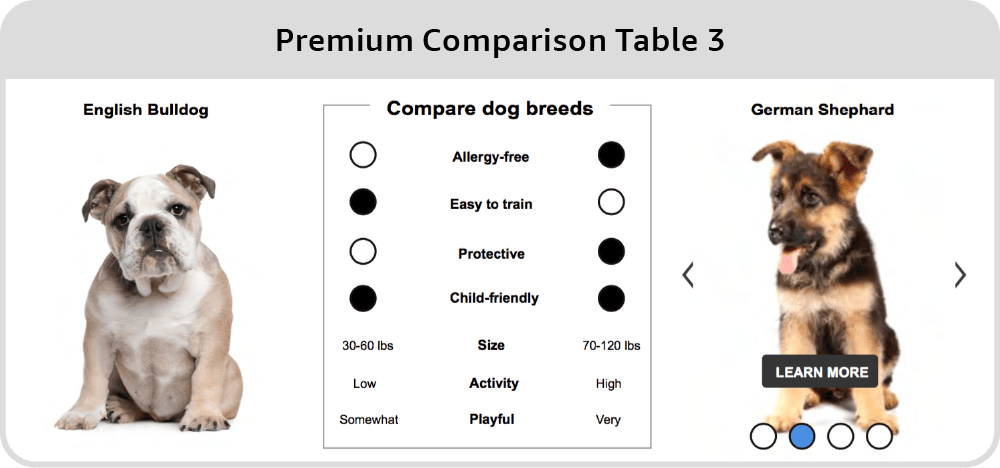
16. Premium Comparison Table 3
Type three of the Premium Comparison Tables is not recommended due to its poor UI design. It doesn’t offer the same user-friendly layout or functionality as the first two types. The design limitations make it less effective for showcasing products or engaging customers. For these reasons, we suggest avoiding this option and sticking to the first two, which offer far better opportunities for promoting your products.
Desktop version
Mobile version
Amazon Thumbnail
Content Guidelines
Comparison products: 2 min – 4 max
Features: 3 min – 7 max
Chart headline: 25 characters
Image headline: 25 characters
Feature: 20 characters
Feature Text: 20 characters
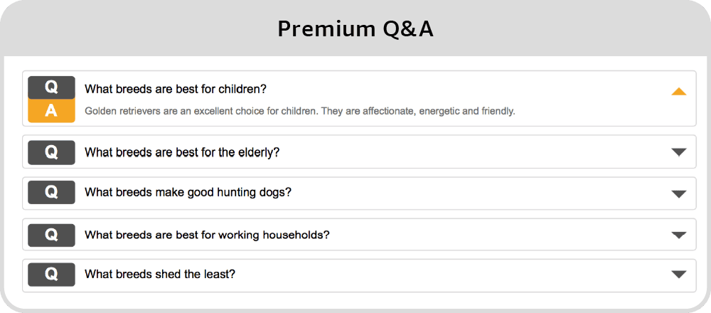
17. Premium Q&A
Throughout this article, we keep saying that images are more important for your A+ Content than texts, but this module is something of an exception. For some reason, people love the Q&A format: perhaps they feel like they’re being talked to personally. Anyway, this module is popular and effective, and you should use it. Keep in mind that there’s a maximum of five questions: focus on the most important benefits your product can bring.
However, since this module doesn’t require any design work, you can easily fill in the text yourself. So, if you’re ordering Premium A+ Content design from an Amazon product photographer or designer, make sure they focus on other design elements. This way, you can decide which module to use later without wasting resources on something you can handle independently.
Desktop version
Mobile version
Amazon Thumbnail
Content Guidelines
Q&A limits: 2 min – 5 max
Question text: 120 characters
Answer text: 250 characters
18. Premium Text
We avoid using the Premium Text module. If you need to add more text, there are plenty of other areas in your listing for that. Since you have access to Premium A+ Content, it’s better to prioritize visuals and make the most of the premium format, rather than using a module for plain text.
Desktop version
Mobile version
Amazon Thumbnail
Content Guidelines
Headline: 80 characters
Body: 300 characters
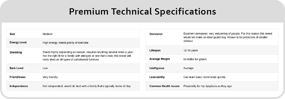
19. Premium Technical Specifications
We generally disregard the Premium Technical Specifications module, but there are a few specific cases where it might be useful. If you need to provide a large amount of structured textual information—like listing which mobile phones a gadget is compatible with—it could come in handy. Additionally, if you’re legally required to disclose certain product specifications, this module ensures that the text remains optimally readable on both large and small screens. Otherwise, it’s usually better to focus on more visually engaging content.
Desktop version
Mobile version
Amazon Thumbnail
Content Guidelines
Specification limits: 4 min-16 max
Headline: 80 characters
Specification: 30 characters
Definition: 500 characters
Bottom Line
If you have access to Premium A+ Content, congratulations, you’re going to sell more. (If you’re not there yet, see our Guide on Standard A+ Content.)
Try to fill your Premium A+ Content with maximally big images, and you can make them into one continuous visual story because there won’t be any gaps between them. Don’t use textboxes: all textual information should be provided graphically right on the images, except for maybe the Q&A module.
When you book a consultation with us, you’re getting expert advice, not a sales pitch. We’ll discuss your needs and explore solutions. If we can help, we’ll provide a competitive offer tailored to your project.
By providing your contact information, you consent to our privacy policy, data processing, and being contacted.
Free shipping from the U.S. to our studio
To make shipping easy, we’ll reimburse up to $150 in shipping costs when you send items from the U.S. to our studio in Israel. We’re committed to minimizing your expenses and effort. To redeem this offer, please request it at the time you place your order with us.
This offer applies to all Amazon listing service orders starting at $1,800 and is only available for shipments from the U.S. to Israel. Shipping from other countries, including China, is not covered.
Get your FREE Amazon listing audit now
Send me your ASIN, and I will review it: no strings attached.
We only do 15 free audits per month for eligible listings. Don’t miss out!
By providing your contact information, you consent to our privacy policy, data processing, and being contacted.
Eligibility Criteria
Your listing is eligible for a free review if it generates (or has a clear potential to generate) a monthly revenue of at least $10,000. If it generates less, but you still want a free review, you can book it, and we’ll contact you to see how we can help.
Note that we do up to 15 free reviews a month and set eligibility criteria only because preparing every personal review is VERY time-consuming.
Iterative Process
Iterative design focuses on creating one optimal concept based on our research and expertise. We present this single, refined design for your approval. In 70% of cases, clients approve this initial concept, keeping costs low. After you approve, we finalize and deliver.
If changes are needed or new concepts are required, we revise or start anew, but this will increase the budget.
Overall, this approach results in faster turnaround and cost savings when the first concept meets your needs.
Conversion Rate Increase by 15 to 200%
In most cases, conversion improved by 30% to 40%
Conversions grew by 40 to 200% when the product was exceptional and competitive within its niche
The conversion rate increased by around 15% when the product was of the same or lower quality compared to competitors
The average increase in conversion rate across all customers is 29%.
Additionally, a 22% increase in CTR was observed (on average)
Essentially, the sales went up, and the ACoS (advertising cost of sales) dropped.